The great place to start how to make a flyer is to think about what catches your own attention. Many companies get this wrong and their flyers are relegated to the recycling bin. To make your work easy we are providing a comprehensive guide to flyer designs.
Make a strategy
It could be tempting to jump straight into designing the flyer, for new designers but not for professionals. If you designed a flyer and wants it to play an effective role in marketing campaign, you should know what exactly that role is going to be.
Well, before you are going to launch yourself into the design process, you should do some paper work on the strategy behind it.
1. Your Objective
While making a strategy you should give priority to main object in your overall design. You should consider what results you will get from your marketing activities when it will be explored in market. You should isolate your overall objective before determining if a flyer is the right tool to support that objective.
2. The Role your flyer should play in Marketing Campaign
When you have your clear objectives for marketing as a whole, you can easily set the specific objective for the flyer. Flyers are low-cost and targeted marketing tool which could be effective in promoting a local business, an event or a specific location.
3. Targeted Audience
Just like everything you do in marketing, you should know about the place where you will deliver the flyer. The audience could be targeted through age, gender, location as well as psychographics thoughts, attitudes and behaviors.
The flyers are not just designed to re-engage lapsed customers with a ‘welcome back’ offer but also for the promotions of new business.
4. Key Message
When you have your targeted audience, you should make decision about the key message you want to convey from the flyer. A message for audience about which you want them to be thinking, feeling or doing. It should be remember able for the audience as they remember about your brand or product.
You can print lot of information on the flyer but in the end you need to be super specific about that one important message.
5. Where will the flyer be distributed?
Flyers can be handed out to any person on the street, pinned onto bulletin boards or sent through the mail or also distributed electronically. You should think about where your flyer will going to be distributed.
When you know about the distribution assets you can make your flyer more reliable. Just like a small flyer should be posted on a wall somewhere which needs to be bigger and bolder to catch people’s attention in the first place. Whereas a flyer which would be handed to someone in person can afford to have more information in a smaller font size.
6. About Colors
The bold and bright colors play vital role in flyer design. They are the source to attract people’s attention. The design must be work with your brand or your industry. For this purpose you can use company’s selected colors in flyer.
You can try the colors that will reinforce your message just like, greens and yellows for health and wellbeing or bright primary colors for children. You should decide carefully about the color portion you will use in your flyer.
7. Identity Elements to be Highlighted
Any type of message you want to put on the flyer, you just have to make sure the reader knows where it’s coming from. You can put the elements of your brand identity that will ensure that people remember who you are and the purpose of your existence.
You can highlight the tagline, a brand mascot or other imagery assets that subsequently makes you instantly recognizable.
8. What would be the size of Flyer?
Flyers have some pretty standard formats just like it could be of A5 or A4. If you want to put something more and it’s not adjusting in that standard then you can expand the size of flyer, but at first you should try to make it in standard size.
You can add the attraction sorts in that normal size easily, later this size and shape is normally used in to handover the flyer. If you want the type of flyer which will be posted on a wall or a board, then you can use something large in size or enhance the size if your flyer.
Best Flyer Design For You:
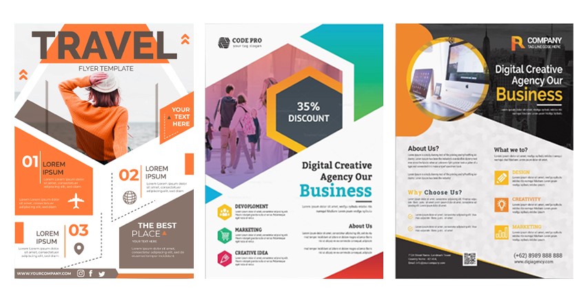
Now that you have your strategy and concept for the flyer, you can go ahead with the actual design.
1. Check the other flyers Inspiration
You can get an idea for what’s possible by checking the other flyers that are out there. When you are a beginner you can collect the similar flyers and see what you like and what you don’t. You can browse existing designs online to see what styles appeal to you.
By checking them you will also get to know about the competition of market and challenge yourself to make yours much better than the existing.
2. Evaluate the design proposals against your criteria
As the designs start coming in, make sure you’re checking them against your brief and what exactly you’re looking for. Make sure the branding is clear, it contain all the pertinent information and the hierarchy of the messages is correct.
Sticking to these objective criteria will help you sort through the designs without getting carried away by some artistic creation.
3. Choose your Final Design
An effective flyer design can easily attracts the right audience, which communicates a clear message and benefit that inspires the audience to take an action. You can use a survey as part of your design contest just to collect a feedback from people from your targeted audience. You should choose the design that fits your criteria and works best for your audience.
4. Proofread
When you get the final design, you should must check it again and again that there are no typos. Bring it someone else to look at it, someone who isn’t as deep into the project as you are. You should make sure that all the information is there. You’d be surprised how many times you get a flyer design that’s missing the date of the event, or the website URL or many flaws. You don’t want all your hard work to be ruined by such an obvious but critical error. That’s why proofreading is important.
5. Make sure you get the all files you need
You’ll be looking at your flyer designs on screen in RGB Colors. But you’ll need CMYK Color mode to print, so make sure you have those converted files. If you have photos as part of the design, they need to be high resolution. It needs a resolution of at least 300 dpi for a print.
You should make sure that your design is inside the edges of artboard in illustrator. As a result it will be printed to the edges of the paper. You have to include a bleed, which is a little bit of extra design outside your desired size to account for printing and cutting errors.
Thanks For Reading
If you liked this article and want to read more of these, please subscribe to our newsletter and follow us on Facebook, YouTube, and Twitter.

