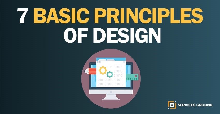
When we talk about the principles of design and try to figure out how many principles are actually there. Then we cannot give an accurate number of principles.
If we try to search “principles of design” on Google, we will return with results from five or more than a dozen individual principles. There are roughly a dozen principles of design that designers should keep in mind while working on their projects.
So, I have just tried to explain 7 basic important principles of design. There is no real consensus in the design community about what the main principles of design actually are.
The following seven principles are those mentioned most often in articles and books.
BALANCE
The Balance of elements in design is similar to balance in physics. Balance provides the proper stability and structure to design. The objects in design carry weight as similar in the physical world, but this type of weight is called visual weight. The visual weight of a design needs to have balanced perfectly which makes a good impact.
It’s just like putting two objects on a seesaw and if one side is too heavy, the viewer’s eye probably goes directly to the heavy part. If both sides are equally weighted, the seesaw would perfectly be balanced without either side touching the ground.
Balance could be implied by size, shape, or contrast.
PROXIMITY
The proximity is actually a relationship between the elements. It provides a focal point. Whereas, proximity doesn’t mean that elements should be placed together. It means that they should be visually connected in an accurate path. As we have learned that every element we place on a page has a weight. The weight could be color, size, or texture.
You can’t crowd all your elements in one area of your composition just like you will not going to put all your furniture in one corner of a room.
ALIGNMENT
It’s the main principle of design. Alignment is the placement of visual elements, to see the accuracy of design as they lined up in composition. Designers use alignment to organize elements, to group elements, to create balance, to create structure, to create connections between elements, to create accurate outcomes. Alignment is also used to organize and create a degree of structure.
In design there are two main alignment principles:
- Edge Alignment
- Center Alignment
The perfect design needs to be in order and organized form. For this, the alignment allows them to create a valuable and perfect design.
CONTRAST
Contrast is the juxtaposition of opposing elements like opposite colors on the color wheel, light and dark shades, directions as horizontal and vertical. The contrast allows us to emphasize or highlight the main points in the design.
The most common complaint designers get from client’s feedback is they say a design needs to be more prominent. At that time client generally means is that the design needs more contrast.
Contrast refers to the difference between elements in a design, particularly adjacent elements. Those differences make various elements prominent. But be careful as an insufficient contrast could make text content very difficult to read, especially for people with visual impairments.
SPACE
Space is an art which refers to the distance or area between, around, above, below, or within elements. The main positive and negative space are two important factors to be considered in every design.
As all of the other elements deal with what you add to your design while white space (negative space) is the only one that specifically deals with what you don’t add. White space is actually the empty page around the elements in your composition.
Simply giving a composition more room to breathe can upgrade it from average to successful. White space creates hierarchy and organization of design. Our brains are naturally associated with ample white space around an element with importance and luxury. That’s why we should keep in mind that principle while designing something.
Hierarchy
One of the most important principles in design hierarchy is a way to visually rank your design elements.
The hierarchy is not actually based on a design style, but the order of elements. A good design leads the eye through each area in priority order as the designer sets them. If we check the homepage of the website there’s usually a navigation bar and a logo, some sort of large header image, or text with a call to action.
The important point is that the logo tells the user about the company’s sign. The navigation shows the user how to get around the site and the call to action compels the user to do something. It’s a design hierarchy that helps the user complete an action or understand information.
A good rule of thumb for hierarchy is that your most important elements should be most prominent in your design.
Emphasis
Emphasis is making an outline of priorities. At first, let your brain organize the information and then lay out your design in a way similar to the order.
Let’s suppose you’re creating a poster for a concert. You should think that what piece of information you want to bring it to the audience in priority. If the band’s name is the most essential information, you can place it in the center or make it the biggest element on the poster. You can also use the strongest, boldest type.
If you want to mention the location, date, or anything else you can easily prominent them by applying the same typeface. It’s all depends on the emphasis on which you are going to do.
If you start your composition without a clear idea of what you’re trying to communicate, your design will not succeed. So, try to clear the concept of design with priority.
Thanks For Reading.
If you liked this article and want to read more of these, please subscribe to our newsletter and follow us on Facebook, Youtube, Linkedin, and Twitter.