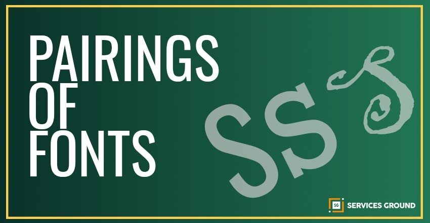
When you start making a logo, design, or branding project, typography is one of the very first decisions you have to make and put in your design. So, choosing a font would be a tough task. You have to select fonts according to the situation as it could be serious and stodgy, friendly and cutesy, modern, and vintage. Here, we’ll take a look at some useful font pairings through which we can enhance your designs.
What makes a good font pairing?
Font pairing is like a good relationship. The fonts we pair at least have some basic commonalities which also preserve their sense of individuality. You can make a pair of two fonts that complement each other but also provide that push and pull of contrast.
The great font pairings start by checking the different families of type like serif, slab, sans serif, script, and handwritten. Just combining two different fonts from the same family generally won’t provide any contrast until you work more on pairing. The design should never feel boring or weak.
In any good font pairing, only one font will have a lot of personalities because two wildly interesting fonts will feel disconnected and out of sync with one another.
14 Best Pairings of Fonts for your next Design
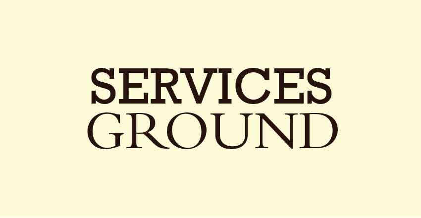
Clarendon and League Gothic:
Those two classic workhorses have perfect pair.
Clarendon brings a literary flair. Here you can get Clarendon
League Gothic’s is thick weighted. Here you can get League Gothic.
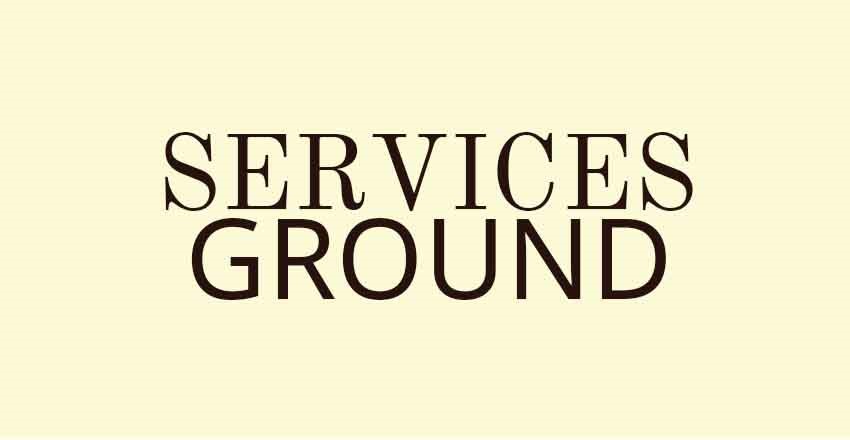
Quando and Judson:
The Quando and Judson are both serifs with a good dose of character and feminine charm.
Quando is heavy with more exaggerated serifs but the hierarchy will be clear and the combination will be successful.
To Get Quando
To Get League Gothic
Allan and Lato:
Allan brings the personality and throwback spirit of hand-painted signs. To get Allan Lato keeps things modern in this fresh pairing. To Get Lato.
Vidaloka and Roboto:
The Vidaloka brings a touch of playful vibes with its curled serifs. To get Vidaloka
Roboto is used to balance the tone just right. To get Roboto
Merriweather and Quattrocento:
They sometimes referred to as superfamilies. Merriweather and Quattrocentro are the type of fonts that have enough weights and styles.
They will combine beautifully with very little effort on your part.
To Get Merriweather
To Get Quattrocentro
Pacifico and Josefin Sans:
These two fonts are well-known and well-loved of designers.
Pacifico brings the fun with its loopy script characters. To get Pacifico
Josefin Sans plays a supportive role with light and clean lines. To get Josefin Sans.

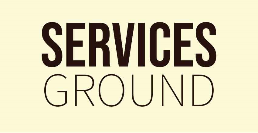
Oswald and Raleway:
Oswald and Raleway are two Internet’s favorite workhorse sans-serifs.
Raleway can brings tiny note as sophistication to the pairing.
Oswald is reformed to better fit with the pixel grid of standard digital screens.
To Get Oswald
To Get Raleway
Playfair and Cormorant Garamond:
Playfair is pretty refined type and is on-trend.
Garamond or Caslon families are considered classic light serifs.
To Get Playfair
To Get Cormorant Garamond
Droid Serif Mono and Montserrat:
Montserrat can be the normal household, and it has two sister families so far, Alternates and Subrayada
A well-spaced Droid Serif Mono is trendy serif.
To Get Monserrat
To Get Droid Sans Mono
Rockwell and Bembo:
A Rockwell can brings old school vibes to the party with its heavy slab structure.
Bembo brings a refinement and class that explains why it’s been around for over 500 years.
To get Rockwell
To get Bembo
Old Standard and Open Sans:
Open Sans can provide a legible reading experience for any design.
Old Standard can evokes an old school book or primer, creating a particularly nice tension.
To get Old Standard
To get Open Sans
Sanchez Nova and Proxima Nova:
Pair of Sanchez Nova and Proxima Nova captures perfectly that tension of new and old.
To get Sanchez Nova
To get Proxima Nova
Brandon Grotesque and Anonymous Pro:
Anonymous Pro is a wonderful programming inspired font.
Brandon Grotesque’s clean geometric style.
To get Brandon Grotesque
To get Anonymous Pro
Bebas and Source Sans:
Now a dasys, Bebas have the strongest display faces in the market. It doesn’t looks bad, and it pairs easily with serifs and other sans serifs.
To get Bebas
To get Source Sans
Like other aspects of design, font pairing is a little bit of art and also science. If you understand the type families, hierarchy and which font is dominant in your design, you can probably adjust the typography in your design. So, never be afraid to push the boat out and try something new.
Now, you’ve seen how fonts can work together to bring strength and depth to a composition. You can make sure the fonts in your next design are truly on point and matched with your other design.
Thanks For Reading.
If you liked this article and want to read more of these, please subscribe to our newsletter and follow us on Facebook, Youtube, Linkedin, and Twitter.