In Graphic Design, there are a few important principles of design that should be known to every designer. These principles work to separate good design from bad design. All these principles have a relationship between each other and appear in every well-designed piece of work you see.
A good grasp of design theory will mean there is always substance behind your work.
The key principles of design are:
- Contrast
- Hierarchy
- Alignment
- Balance
- Proximity
- Repetition
- Simplicity
- Function
For a magazine, poster, website, advertisement or anything the principles of design should be considered as same.
A good designer will keep these principles and guidelines in their toolkit and will consciously use them to develop their ideas in his designs.
Let’s have a close look at the Alignment Principle of Design:
Alignment Principle
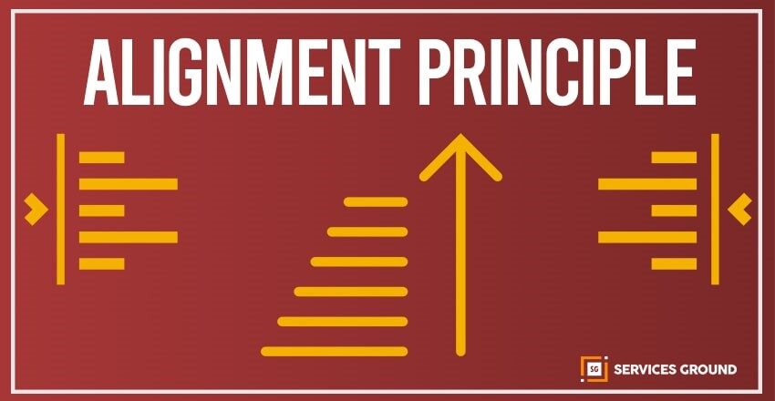
Alignment is the placement of visual elements, to see the accuracy of design as they lined up in a composition. Designers use alignment to organize elements, to group elements, to create balance, to create structure, to create connections between elements, to create accurate outcome. Alignment is also used to organize and create a degree of structure.
In design there are two main alignment principles:
- Edge alignment
- Center alignment
Edge Alignment
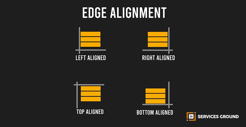
The Edge alignment is either to the left, right, top, or bottom. Edge alignment actually determines the placement of elements in relation to the edge of the page, canvas, or artboard. When the alignment is right or left, we call it a horizontal alignment, though it is still an edge alignment. And when the alignment is top or bottom, it is vertical alignment.
When we write any text, we usually use left alignment which means all the lines to the left of the page line up along that side.
Center Alignment
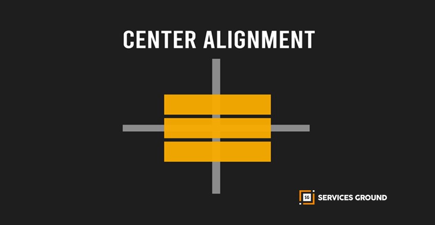
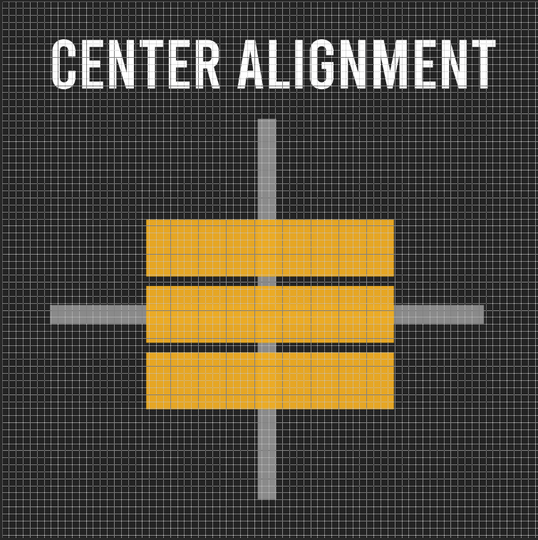
The Center alignment is that all elements are aligned to a centerline down the middle or across the horizontal. Alignment is often an invisible line, which aligned visual elements. Alignment can be used to achieve a particular look and feel in design. One should always be conscious when working with alignment to achieve the intended result.
Good Alignment
Where visual elements are accurately aligned, a composition can appear clear, confident, elegant and formal.
In design, we should try and avoid the appearance of having made arbitrary decisions. When visual elements are out of alignment, it is noticeable, and we can adjust it if we give it intentions.
Mixed Alignment

If the mixed alignment is intended as part of a design, it would appear more radical, dynamic, free, and playful.
Using Grids to Align
Alignment can be simple or complex and is commonly achieved by using a grid. A grid is used to create an invisible structure through which we can place visual elements perfectly. These grids ensure accurate alignment and consistency in a large piece of design work. Nowadays, the grids are typically constructed in design software as a guide when you create a layout on a computer.
Elements to Align
Text
Text in each alignment style is self-explanatory if you use it carefully. At first, you should think to see how each alignment fits your design and how well do they go along. You can use headers and short text for center alignment but it might be a bit confusing for the readers. You can also use a universal language for the former, but for the latter, you can use either flush left or flush right.
Images
Placing the images could be difficult than placing the text. It isn’t as easier because the alignment refers to the size of the image. You can place smaller images such as a single logo within your content without even disrupting the content itself, on the other hand, the larger images are known for interrupting the reading flow, hence those are more difficult to place inside the content.
What you can do to solve this issue is placing the images outside your content, like you can put it between paragraphs and before/after the content. To align them you can also assign slots from images in the gird as well.
Background images
The alignment of background images is one of the trickiest parts as it depends on your design and the. The alignment of background images can be pretty rigid in terms of their designation and orientation. The background images you choose should be contrasted with the overall design and also the alignment otherwise your design would be a total disaster.
Well, you must be able to question the parts of your design with respect to their alignments of elements and, think about how you can polish your design and make it work well.
When you look at your final design, ask yourself:
- How has alignment been considered?
- Is there a clear structure that has been used?
- How well does it work as part of the design?
Designers have a habit to experiment with various alignment types in their design. That is why they are less likely to stick to one alignment during the designing process. If we see designs with pure concentrate, we can see the designs are usually made on grids, which support the design and maintain its consistency.
If your structure is strong, you must align the elements carefully to give a neater and crisper look at your design. Here is what you need to consider regarding various design elements and their alignment.
If you liked what you read, make sure to subscribe to our newsletter. You can also follow us on Facebook, Instagram, and YouTube.
