Now a days, the Vintage logo designs are all around us. Each and every day you can see new impressive collections of retro logos, old school logos, and other pretty amazing vintage logo designs. The Vintage logo elements are also useful for modern projects by just adding vintage touch in Logo.
So, if you want to get a vintage and retro logo for yourself, or looking for an ideas, you can find it out here. Because there are a lot of options for vintage circle logo, vintage badge logo and even a modern vintage logo. Just keep notice that not all of them work everywhere.
So, here you can read few vintage and retro logo design tips and tricks, you would be able to perform work by just reading them carefully.
Just take a look at Six top tips for exploring, planning, and creating a vintage and retro logo design.
1. Research

First, do a proper search about and acknowledge about the company’s reputation. If you’re looking to make a modern retro logo design, first you have to find out which decade it belongs to and try to identify if the design was typical of a certain industry or area.
The main purpose for this is that you should know about what type of logo you can make for com. The whole point of branding is about to make stand out assets for a company by proper research
You should look at the classic designs on a decade by decade basis to find something in the past that that suits your particular aesthetic. You can also create something new by fusing the aesthetics of different time periods.
2. Typography
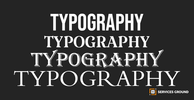
When you’ve explored design by the decade, you might have seen the typography you should use. Well, if you’re not planning to put decade typography type into your logo, you can also use modern typography by just adjusting it perfectly.
The Fonts and Typography are much considerable to become a part of your overall vintage and retro logo design. You don’t have to restrict yourself to use fonts from decade you can use which looks good to you and suits on logo. After all, fonts like Futura or few more are still used today, despite originating in the 1920s.
This exercise is about finding the typography that complements your overall design and feels like it fits the aesthetic.
3. Explore Color Palette For Vintage and Retro Designs
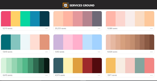
Another one important aspect of vintage and retro logo design to remember is that, the people in the past didn’t have access to wide range of colors as compare today. The historical design colors relies on a stripped down color palette. If you take a look on that as you comb through potential designs.
A limited color range can make vintage and retro logo design. Because it usually stucked to handful colors at most but you can also take cues from the most successful logos of the era you’re aiming for.
4. Badges and Borders
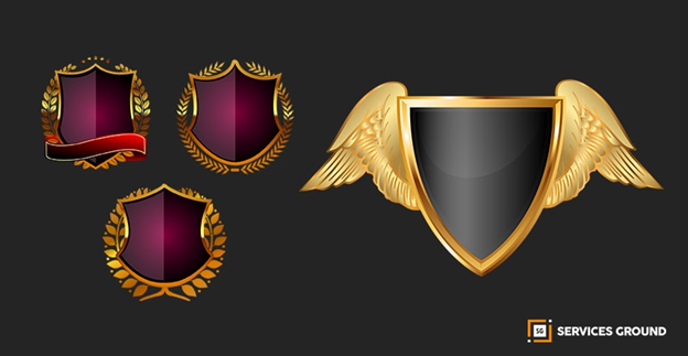
You can follow the common theme of vintage and retro logo design which interest in badge-style iconography and defined borders. The Badges always have a cool cachet that evokes different varieties of companies and the space program.
If you merge retro badges and modern sensibilities well-aligned with the badge-like your logo will have a better look of vintage. You can just find a badge for your brand that follows a decade-appropriate design aesthetic just to increase synergy across your platforms while maintaining the retro cool.
When you use thick border lines this would be glamorous as retro designs. The thick sticks helps your logo to pop amid the competition.
5. Keep It Simple
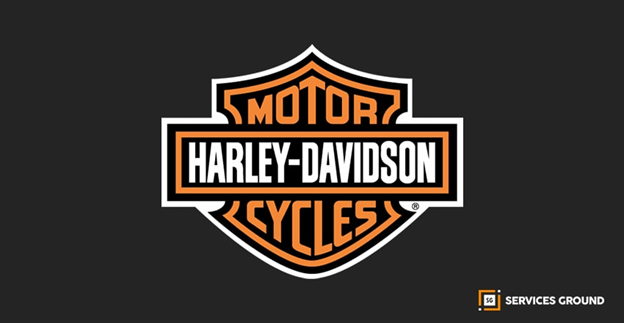
Simplicity is the state or quality of being simple in any condition. It usually relates to the burden which a thing puts on someone while trying to explain or understand it. Something which is easy to understand or explain could be simple.
Alternatively, something could be simple or complex depending on the way we choose to describe it. Here we need a vintage and retro design logo so we can make it simple by just adding few concepts of vintage purpose.
Bringing vintage logo have lot of fun, but in imitating older designs it can be tempting to overdo it. You can make professional brand logo design to stand out, but don’t let that be an excuse for over designing your look.
6. Elements could be used in Vintage and Retro Logo Design:
Here we have few elements to use in Vintage and Retro Logo Design:
- Shapes like Circle, Square, and Rectangle etc
- Dotted shapes as similar
- Badges and Label Tags
- Faded Texture
- Ropes
- Hooks
- Lines
- Compasses
- Farm Tools
- Wildlife
- Arrows
Thanks For Reading.
If you want to read more of these, please subscribe to our newsletter and follow us on Facebook, Youtube, Linkedin, and Twitter.

