Minimalist web design is an art of Designer. Probably, you have heard saying ‘Less is more’, it means they are referring to minimalism. With the passage of time technology opens up new possibilities in site design, it becomes more difficult to resist adding some fancy flourishes in site.
At first you might think, by just reducing a design you can make a minimalist website, but it requires proper strategy to approach your creative work.
Minimalism is use to make website look intelligent, smart, modern, effortless and capable of achieving much more with less. Because when distraction goes down, action, engagement and conversion goes way up.
Here we have essential tips for making minimal website.
Essential Tips
A minimal web design takes those essential design elements. By using these elements, designers strip away layers and layers of clutter to create a balance that is not only pleasing to the eye but also delivers a message.
1. Negative space
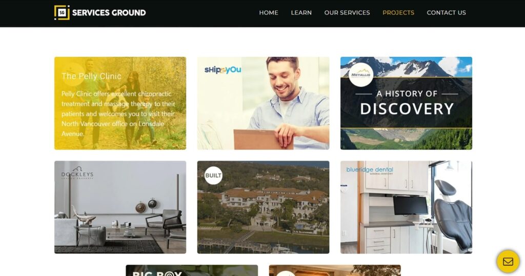
Well if you one don’t know about the purpose of negative space in design then you can easily think that negative space is just a waste of space. So, if you have heard about it before then why would you want to have an empty space in the layout?
If you also don’t know. Let me tell you, negative pace is valuable! The reason of its importance is that the negative space has its own specific purpose as you can use it to manipulate the user’s attention and visual flow. It is well tested fact that the more negative space around an element, the more the eye is drawn to it.
If you want to emphasize something and you don’t have more color or bolder fonts to use then you can use negative space. Always surround the element you want to emphasize with decent amount of space in minimal design.
Negative space also improves comprehension and readability because space gives users a better experience without tiring their eyes. The readers find short, separate text blocks more appealing than lengthy ones without space.
Negative space can be a powerful element in a minimalist design. You just have to know how to use it in the right way to make design perfect.
2. Visuals
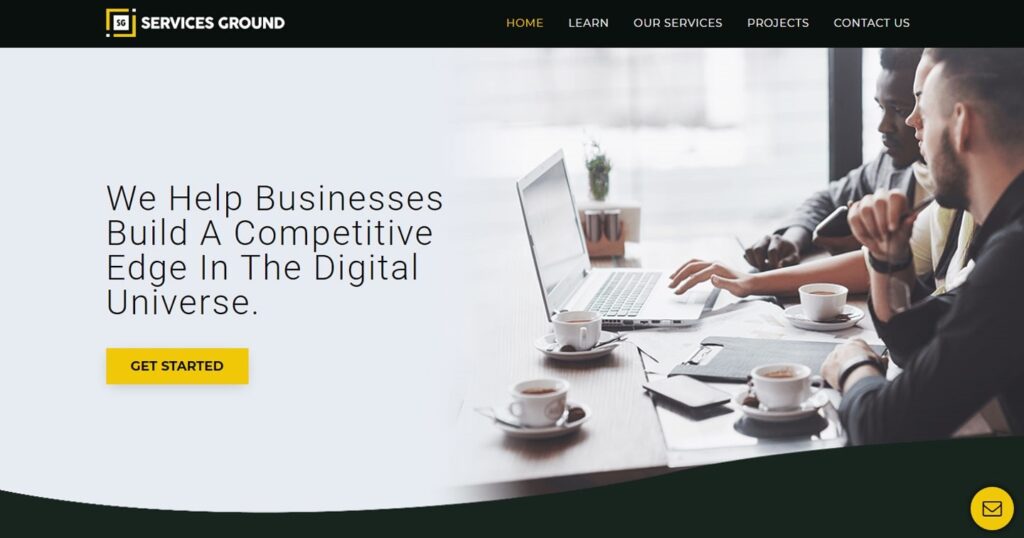
Bold, big and contrasting visuals sets the stage for an effective minimalist web design. Visuals could be images, videos, and even typography that build a first impression of your site.
Google can report the user’s opinions about a website within 17 milliseconds. In minimal point, the simpler the visuals, the more they appeal to the users. Well, first impressions created by visuals aspects of site.
In minimalist websites, striking and high-quality visuals could be useful because unique visuals breathe life to your website design. Those visuals also can be used in the background as white/negative space.
So, you can use them to enhance the site’s appearance, draw focus, build accessibility and increase usability for user.
3. Typography
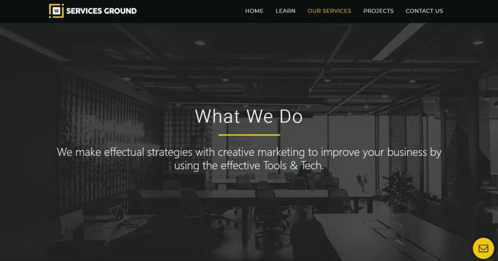
Bold headline fonts paired with smaller, legible body text which can make a huge impact on site. When user visits a website, they want to learn what it’s all about, that’s why you should use good pairing of fonts to bring him ease.
Like all design elements, typography also has a language all its own like its style, size, spacing and other attributes which gives every font a specific personality.
Typography is so attention-grabbing and great typography makes navigation and comprehension easier. So, just choosing the right fonts can improve readability by creating a clear hierarchy of your messaging. It helps the user to enjoy their experience.
4. Colors
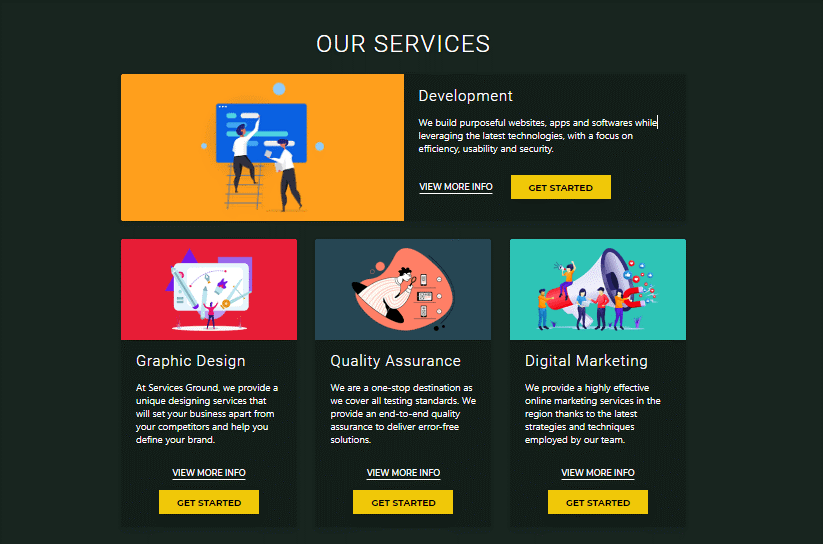
Minimalist web design employs a comprehensive range of colors. Those could be from neutrals and pastels to primaries and neons. Those colors connects all the design elements together to create a seamless visual experience. The colors also evokes emotion and helps both your design and copy engage with users on a deeper level.
Try to avoid the textured sandy background. You can use simple colors by checking the contrast which suits to your site. You can use dark text contrasts with the neutral background, which guides the user to the important elements on the site.
The color scheme creates a pleasing and inviting user-experience. Subconsciously, users absorb the emotional vibe of the brand and connect personally with the website.
Thanks For Reading.
If You want professional web design, app design, logo design, or Development. FEEL FREE TO CONTACT US
If you liked what you read, make sure to subscribe to our Newsletter. You can also follow us on Facebook, Instagram, and YouTube.


