
There are different types of logos. A logo is a graphic mark, stamp, symbol, or stylized name, used to recognize a company, brand, product, or organization as well. It is form of an abstract and figurative design it also presents as stylized form of the company’s name. It should be an image that symbolizes your business.
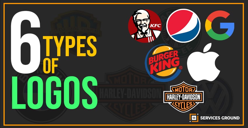
So, before you are going to bringing it you should know there are 6 different types of logos.
- Monogram or Lettermark Logos
- Wordmarks or Logotypes
- Pictorial Marks or Symbols
- Abstract Logo Marks
- Mascots
- The Emblem
Though they’re all a combination of few assets like typography and images, each type of logo gives your brand a different feel. Your logo would be the first thing new customers will see. So, you should make sure you get it right.
To helping you, here I am mentioning the 6 types of logos you need to know about.
1. Monogram or Lettermarks Logos
Monogram or Lettermarks logos consist of letters, usually brand name’s initials. Just like IBM, CNN, HP and HBO. Have you ever noticed their pattern? Those are just initials of few famous businesses with rather lengthy names. Initials are the 2 or 3 words to remember, they’ve each turned to using their initials for brand-identification purposes.
Whereas, the lettermark is all about simplicity. Lettermark is similar to Monogram as they are effective at streamlining any company brand if they have a long name.
If you look at NASA, how much easier is it to say and remember NASA as compared to National Aeronautics and Space Administration?
When you’re going with to make initials for logo, choosing font is very important. You should make sure your logo is not only on-theme with what your company does, but also eligible when you print on business cards.
You can consider a lettermark logo if your business have a long name. Converting the business name into initials will help simplify your design. Likewise customers will have an easier time recalling your business and your logo.
2. Wordmarks or Logotypes
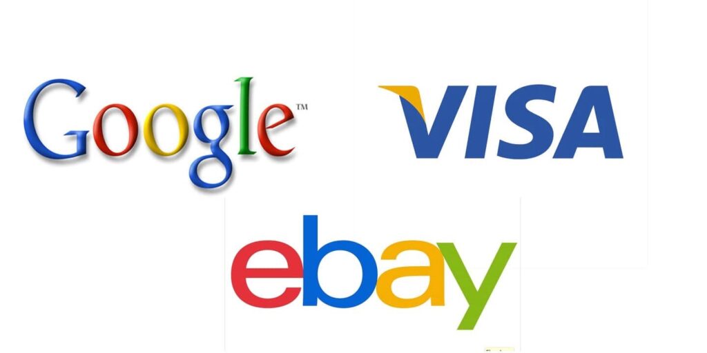
The Wordmarks are similar to a lettermark or monogram. A wordmark or logotype is also a font-based logo that focuses on a business by just name. If you take a look at Visa and Coca-Cola those logos work really well when a company has a succinct and distinct name. If you think about Google’s logo, it is also a great example of the Wordmark logo. The name itself should be catchy and memorable. So, when we combined it with strong typography, then the logo helps to perform strong brand recognition.
In a Wordmark logo, typography will be an important decision. It’s that important because the focus will be on your name. You should pick a font or create a font that captures the essence of what your business does.
A wordmark should be a good option when you have a new business and need to get your name out there. You just have to make sure that name is short enough to take advantage of the design. Anything too long would look too cluttered, try to avoid them.
3. Pictorial Marks or Symbols
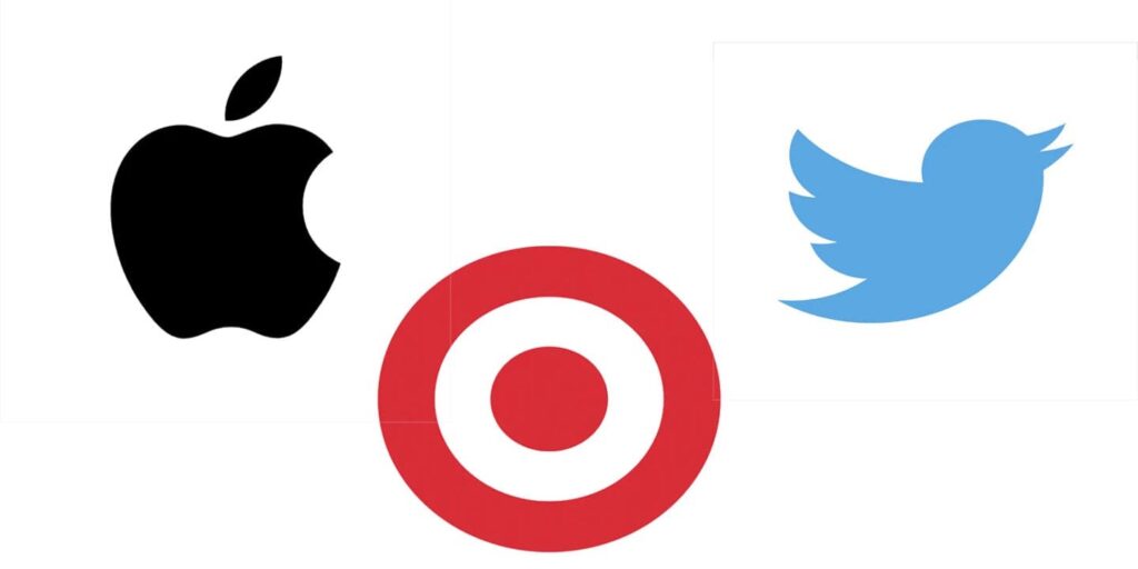
A pictorial mark is the type of logo which sometimes called a brand mark, logo symbol, icon, or graphics-based logo. The image that comes to mind when you think about this type of logo just like the Apple logo, the Twitter bird, the Target bullseye. All of these companies’ logos are very emblematic. Each brand is properly established, that’s why the only mark is instantly recognizable. So, it can be a tricky logo type for new companies, or those without strong brand recognition, to use.
The main point you should consider when deciding to go with a pictorial mark is the type of image to choose. This going to be something that will stick with your company its entire existence
A pictorial mark is effective if you already have an established brand. You can easily use brandmarks to your advantage to convey what your business does graphically if your name is too long, and they can also be used effectively to convey a desired idea or emotion.
4. Abstract Logo Marks
An abstract mark is a specific type which belongs to pictorial types of logos. Instead of being a recognizable image like an apple or a bird, it’s an abstract geometric form that represents your business. A few famous examples are the BP starburst-y logo, the Pepsi divided circle, and the strip-y Adidas flower.
Abstract marks work really well because they condense your brand into a single image instead of being restricted to a picture of something recognizable. Abstract logos allow you to create something truly unique to represent your brand in the market.
The benefit of using an abstract mark as a logo is that you’re able to convey what your company does symbolically, without relying on the cultural implications of a specific image. By using color and form, you can add attribute meaning and cultivate emotion around your brand like Nike swoosh implies movement and freedom.
5. Mascots
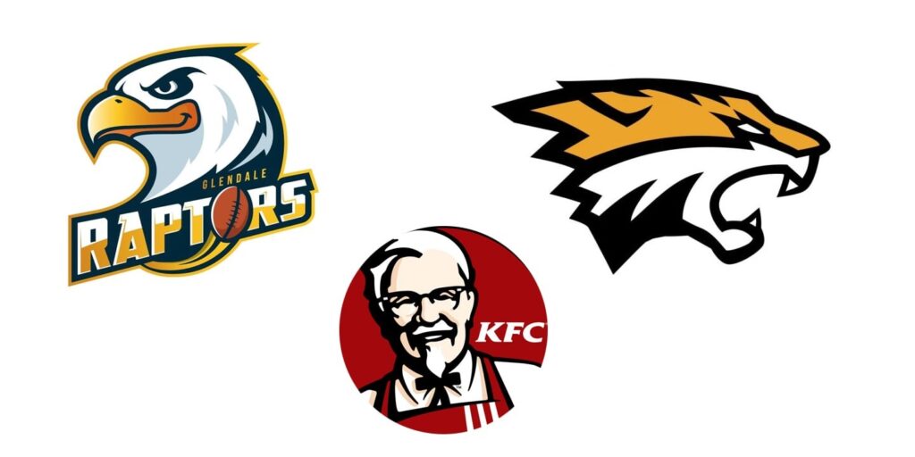
A mascot logo is a type of logo that involves an illustrated character. Those are often colorful, sometimes cartoonish, and most always fun. The mascot logo is a great way to create your very own brand spokesperson.
Well, a mascot is simply an illustrated character that represents your company. If you take a look at famous mascots like Kool-Aid Man, KFC’s Colonel, and Planter’s Mr. Peanut. Mascots are great for companies that want to create a wholesome atmosphere by appealing to families and children like it is beneficial for cafe’s restaurants, joy lands, or other fun places. Mascots are also useful at sporting events and the great dynamic they create by getting involved with the audience.
A mascot is only one part of a successful logo and brand, and you may not be able to use it across all your marketing material, because a highly detailed illustration may not print well on a business card. Try to put some consideration into the next type of logo design below, the combination mark.
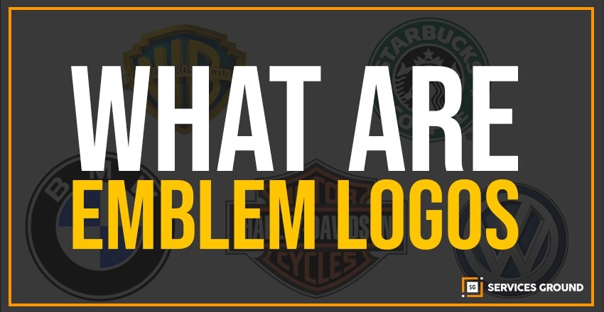
6. The Emblem
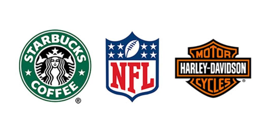
An emblem logo consists of a font inside a symbol or an icon just like it could be in badges, seals, and crests. These logos have a standard appearance about them which will make a striking impact, thus they’re often choice for several schools, organizations, or government agencies.
The auto industries have emblem logos because of its classic style. Some companies have effectively modernized the normal emblem look with logo designs that fits the 21st century just like Starbucks’ iconic mermaid emblem or Harley-Davidson’s famous crest.
Because of their higher details, the name and symbol are rigidly entwined, they are less versatile than the aforementioned types of logos. An intricate emblem design won’t be easy to duplicate across all branding. If you use it for business cards, a busy emblem may shrink so small before it becomes too difficult to read. Try to keep your design uncomplicated.
The traditional look of the emblem’s logo is usually favored by many public agencies and schools but it also can serve any up-and-coming private business quite well, especially those in the food and beverage industry. Just look at beer labels and coffee cups like Starbucks, but remember to play it safe when it comes to detail.
Thanks For Reading.
Also Read.
How To Download And Install Photoshop for free 2020
Top 6 Graphic Design Apps For IOS
Top 6 Graphic Design Apps For Android
Alignment Principles Of Design
How To Make A Logo In 10 Minutes
TOP 5 free ONLINE GRAPHIC DESIGNING TOOLS
If you want to read more of these, please subscribe to our newsletter and follow us on Facebook, Youtube, Linkedin, and Twitter.